In the last article on Basic Editing with GIMP, I talked about cropping and using auto white balance tools. For many of my pictures, this gets me 80% of what I need. Today I will be going into more advanced photo editing using some of GIMP’s other tools.
While I call them advanced, they are still relatively simple to do but require a bit more time and focus -thus adding in the advanced title. But I hope to display the steps in a fairly straightforward way that any of you could try at home and see what it does for your pictures.

Watch the Video
As I attempted to write up this tutorial and take screenshots, I realized much of this would be better suited to video, so I welcome you to the very first Broken Paintbrush video! All the text notes are written out below still so if you aren’t able to watch the video now, still feel free to read.
As this is my first video tutorial, I would love your thoughts, either here in the comments or on the YouTube channel itself.
Advanced Picture Editing
While GIMP and Photoshop (and many other photo editing tools) have a huge number of options, brushes, rendering capabilities, and layers of complexity, even my ‘advanced’ photo editing uses very little of it.
I’m pretty  much limiting it to:
- Manually adjusting white balance and color levels
- Fuzzy and color select tools
- Smudge and Clone
- Adding a watermark/logo
So let’s get to it.
Manual Adjust Levels
Again, in my basic photo editing tutorial I talked about how the auto white balance and auto color correct can make a huge difference in my pictures – bringing grays back to white and making the highlighting pop.
But sometimes these auto tools take it too far or grab the wrong thing for whites and blacks.

Still a little yellow
Just as your camera is attempting to automatically correct its white balance and many times not getting it quite right, so too does the best software not know exactly how you want to see the picture.
Using Level Correction
So instead, we are going to use the levels tool to manual adjust the balance. Levels can be found under colors->levels and will pop up a new box showing a histogram of your image based on its brightness levels.

Just below the histogram there are three little triangles, one at each end and one in the middle.
- The black triangle on the left will darken the image
- The white triangle on the right will lighten it
- The gray triangle in the middle will adjust the gray balance
These values take a bit of playing around with until you’re happy, but a quick start is to just bring each end up to where the histogram starts rising (see the picture below).

After Using the Auto White Balance, manually adjusting rest
The middle slider is a way to add more depth by making it darker or lighten the whole image if it seems a bit dark. This one is helpful for overly dark pictures that aren’t showing the details. By sliding to the left a bit it lightens the overall image without making it bright. Instead, it lightens out the grays, washing out a bit of the color with it.
This is part of the trade-off with the post-process image correction. You can only do so much with a picture already taken, but for a free tool, it does an excellent job of making the most of a standard camera and desk lamps.
When you’ve adjusted the picture, you can always go back and try the Auto Color Enhance tool; sometimes this will bring the colors back out.
Curve Toolbox
If you want to tune the overall distribution, the curve tool box takes it to the next level.

Rather and the three sliding selectors, this places a curve above the histogram so that you can pull up or down values at each point. This is a rather powerful tool, but one that I haven’t yet got the hang of. But for those power users out there, here is where you will want to be.
What I do use the Curve Toolbox for is if the image has an incorrect hue. Sometimes the camera tries to adjust by adding a bit too much red or blue into the picture. The white balance can help with this, but other times it gets even more confused.
At the top of the Curve Toolbox, there is a Channel drop down box where you can choose Red, Green, or Blue channels. Here you can fine tune each color band and decrease the tint.
Area, Fuzzy, and Color Select
Ok, so everything so far has adjusted the whole image, but what if you need to change just a part of the picture? For me, I often change the background even more to reduce variations in the material.
To select certain areas, GIMP has a few different tools:

- Rectangle/Oval Select: selects a particular area based on the shape
- Lasso Select: allows you to draw the outline of the area you want to select
- Fuzzy Select: chooses the vicinity based on the color you choose
- Color Select: selects all the color in the image that is similar to where you click
For each of these select commands, you can hold shift before choosing to add to the selection or control to subtract from the selection. This is super helpful as you build up the area you want to adjust, or remove parts that shouldn’t have been selected.
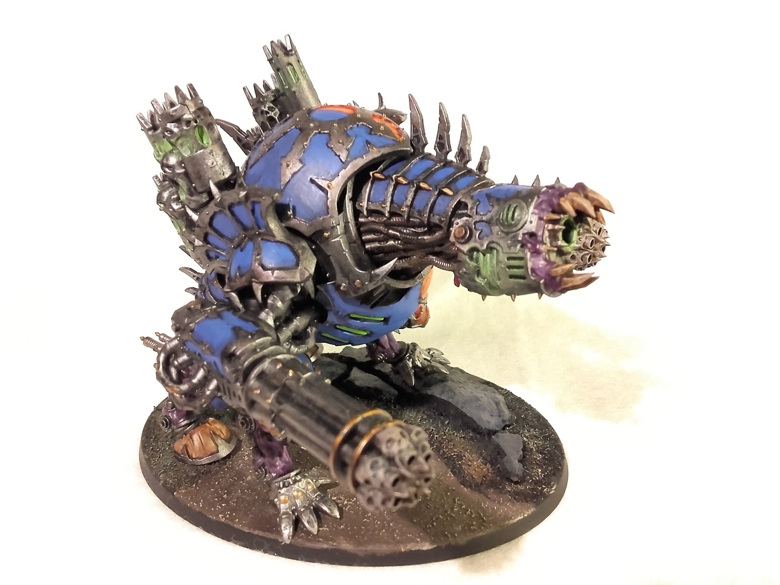
Once you have an area selected, you can do further editing on just that section. The Ork Kopta below had been photographed on a poster sheet that turned out to have some slight ridges in it – hard to see in person but showed up in the shot. By using the fuzzy select, I could use the level tool to wash out the whole area and create a white background, free of distraction.

Red lines are where fuzzy select would be
The color select can be super helpful if you need to pull some of the colors back out. When using the levels they can become a bit too faded. So use the color select and click on the color that needs adjusting, you can the make the level adjustment just on it.
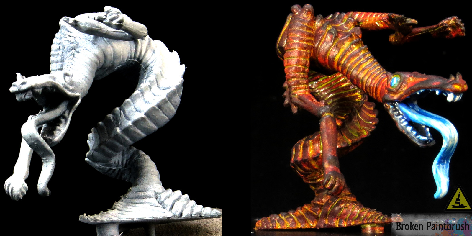
Remember, I’m not advocating creating things that don’t exist on your model (unless you want to do a krautscientist visual effect). But if the photo isn’t doing you paint job justice, these tips can help bring some of it back out.
Smudge and Clone
Recently I bought a Foldio light box, which is great, but then I also mounted a painting project on cut-in-half corks. Every time I took a picture, a bit of the cork crumbs got stuck on the felt backdrop.

Notice the white specs, using the smudge tool I quickly remove them
This left bright dots around the mini that were super distracting.
Since I was using a solid black backdrop, I could have just used the Gimp brush tool to color over them. But what if the backdrop has a bit of variation in like the great looking Hanger 49(?).
For something like this, the clone and smudge tools could be much better at cleaning up.
Smudge Tool
Just as the name implies, the smudge tool acts like a figure pushing around still wet paint.
The beauty of this is that it blends the colors together as you drag it, so a spec in the middle of multiple colors can be blurred away.
Clone Tool
The clone tool is a bit more complicated in that you first need to hold down the CTL key and click in the area you want to copy from. You can the drag around in an area you want to copy over.
As you drag around the copy source moves relative to the cursor. This helps if your background has a gradient that you need to follow as you cover over the imperfection. CTL click near the mark, regular click just before it, and drag on through it.
Watermark
Adding a logo or watermark is a pretty simple step as soon as you have created it (leave that to another post as well).
Not everyone goes for the watermark, and some can be a bit distracting. I have always felt that my finished pictures are a bit of art in of themselves, so the watermark is a bit like my signature. If people share them around the web (which I am entirely happy with) it will always credit back to me (I have seen not so nice people use other people’s pictures and claim it as their own).

The watermark itself should be saved as its file and ideally in a GIMP native format of .xfg which will allow multiple layers, transparency, and scaling to be kept and easily modified. With the base watermark saved, I then scale it down (using scale image tool) to a reasonable size for the watermark (~400x200px for a 1000px picture) and export it as a PNG file. This will allow quick copy and paste into your image.
Adding it In
With both your picture and the PNG watermark file open in GIMP, just click on the select rectangle box and select the whole watermark image. Copy it and in your photo paste it in. Before clicking anywhere, you should notice that on the right side there is a ‘layers’ section that shows your picture layer and a ‘pasted layer.’ This new layer is a floating layer that will get ‘dropped’ on to the layer below once you finalize the position.

To do this, click on the move tool and then start dragging your watermark where you want it to go. If you start pulling the picture, or the watermark gets dropped too early, you can always hit Ctrl-Z and undo the move/drop. Once you are happy with where the mark is, you can click anywhere outside it (the cursor should have an anchor icon) and it will be added to the picture below.
Resizing
If your watermark was too big for the picture, you could resize it after pasting it over (but before dropping it). Select ‘layers->resize layer’ and this will allow you to adjust just the floating layer.
Transparency
One of the things I do with my watermarks to make them not stand out as much is to paste them as semi-transparent layers. Remember that layers box on the left? Before dropping the pasted floating layer, you can select the transparency level right in this tool box. Dragging it down to 80% or so will allow it to be still seen, but not stand out too much.
Wrapping Up
I realize that was a lot of steps and details, but I hope that I was able to break them down a bit and make it clear why and how you would use it for your miniature photography. These advanced photo editing skills are always needed and for the most part, could be skipped. But if you are looking at adding a more polished look to show off your work, they can help bring out the best of your model.
