Latest Posts

Adding pictures metadata so they get found and shared

Adding Pictures to Your Blog – Uploading, Editing, SEO

In the greater blogging world they speak of the importance of adding pictures to posts, the get more readers, shares… blah blah blah. In our hobby community, adding pictures isn’t the problem (we are sharing our painted miniatures after all) but rather may don’t understand the importance of the metadata associated with the image.

Adding pictures metadata so they get found and shared

As hobby bloggers, we are often uploading our images or WIP models, finished collections, or battle reports to have readers enjoy, critique, or even find us. It’s that last point I wish to speak on today as I’ve noticed many of my fellow bloggers miss out on new readers by not adding a description to their images.

The Might Google Image Search

If you go to images.google.com right now and type in your army, faction, character, does your miniatures pop up? Perhaps that doesn’t matter to you, but if you spent time creating a post on your conversion or a fantastic painting tutorial, having new people find it would be good yeah?

While the Google is smart (scary smart sometimes) it still can’t scan your blog, see the picture of you finished Kill Team and know to show it to people looking for Deathwatch squads. Not unless you give it some help.

Adding Pictures to Your Post

It all starts when you upload your image to your post. Actually a bit before when you save the image.

Perhaps you checked out my post on editing pictures or are taking the pictures straight off your camera phone. Either way, if your image file is named IMG_2639.JPG you are missing out on step 1: change the picture filename.

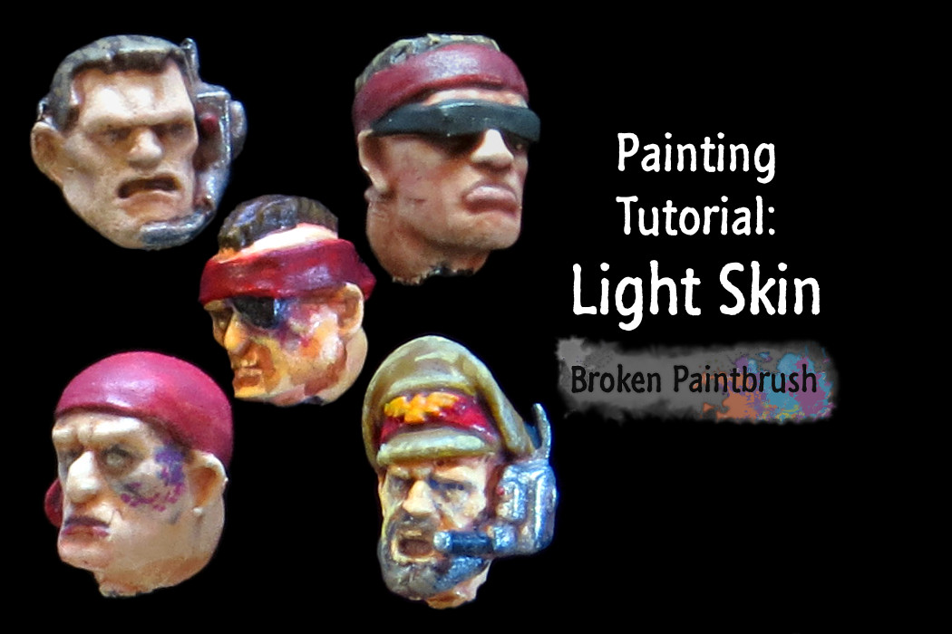
Before uploading it, change the name of your image to include a basic description of what it contains. The image name above was from my painting light skin tutorial, so the I changed the image name to: painting-light-faces-1-drybrush-base.jpg

Now not only will Google be able to look at the filename and parse out that it’s about painting light faces, but if someone right clicks and saves it to their computer, they get a description of the file as well. Super useful when someone puts together a post like Good Reads 🙂

Alt Text and Title

Now that your image has a propa’ name, it’s ready to upload to your post and share it with the world!

Well, almost. A picture on the internet has three additional pieces of information that tools like Google image search and Pinterest use to understand the picture. These are the Alt Text, Description, and Image Title.

Alt Text

The Alt Text is meant to replace the image if the user can’t see the picture. Use it to describe the basics of the picture in case it didn’t load correctly or your reader uses a screen reader. This seems to be what Google uses as the primary text field for its search bots, so make sure it is descriptive.

So Step 2: Add Alt Text that describes in words what the picture includes. If it is an Ork Boy with Big Shoota, that will make for a good Alt Text entry.

Image Title

When you hover over a picture, it is the image title that pops up as a text overlay. XKCD uses this to add a little quip about the comic. You should use it to add a simple title for the image for the user to see when they hover over it.

While not used as the primary source for search engines, it is still useful for screen readers and the Pinterest Pin tools. So Step 3: Add a Title.

Description and Caption

On WordPress, images have the additional options to add a description and a caption.

The caption is text that is displayed under the image (as the name would suggest). It’s not part of the picture data itself, so it doesn’t help with search results. But if it adds something to help your read understand the image, add it. I use it on the Good Reads to give credit to the creator.

The description is only shown on the image’s page. Didn’t know WordPress create a page for every image? It’s not typical for sites to link to the attachment page, but some themes/plugins can use it for the gallery views.

Importance for SEO and Social

Adding metadata to pictures to help seo

So how does all this get back to getting found and shared?

SEO

It’s all part of the magical SEO (Search Engine Optimization) that internet marketeers (without the swords) use to describe how to maximize your chance of getting found by search engines like Google.

We can start it from how you search. If you are starting to think about an army of blue Skitarii, you might pop that into Google to see who else has done Skitarii in blue. A bunch of pictures pops up of metal men in blue robes – just what you were looking for! Maybe you even clicked through a couple to see who painted it and what else they did.

Want someone to do the same and find your images and click through to your site?

The add the metadata mentioned above and help the Google understand what is in your pictures.

Pinterest and Social

While Pinterest is viewed as a stay-at-home-mom spot sharing recipes and knitting tips, there are are a ton of hobbyist sharing pictures there. I’ve only dabbled with it myself, but doing a search for Warhammer 40k boards gave me hundreds to peruse through.

Adding titles to images for Pinterest

Why bring this up? Because people might be ‘pinning’ pictures from your site.

With a simple plugin to your browser, each picture can get a button to save it to one of your boards. When they do so, the Title of the image is used as the default description. So when people find your picture on Pinterest, it is the Title that tells them what it is, and possibly who painted it.

In Summary

If you only took a few things from this post, or only want to do a few changes, try them in the following order:

  1. Add the Alt Text to a picture that describes what is in it
  2. Change the filename of the picture before you load it to be descriptive
  3. Add a Title to the image for services like Pinterest to nab
  4. On WordPress you can add a Description and Caption if you want

Your Homework

It’s now back to you. Next time you upload a picture to your blog, make sure you take a few extra minutes and add an Alt Text and Title. Add them to some of your most popular blogs. Add them to your favorite pictures.

Continue to add them as you go and see if your incoming traffic from search goes up. Do a search for your own miniatures and see where they are in the results.

Dreadtober Introduction – What to Expect for 2016

Dreadtober is three things: fun, productive, and starting soon! Maybe you took part in it last year, or at least saw it take over your social feeds, or maybe it’s brand new. Either way, I want to provide a Dreadtober Introduction for you here and invite you to join in.

Dreadtober Painting Challenge

Photo/Drawing/Logo by Todd @ Sincain40k

Do you have a dreadnought, Deff Dread, battle suits, Carnifex, Warjack, or anything along that size? Does it need painting AND you want to join in with a ton of other community members to get it done in a single month?

Then Dreadtober is for you!

Greg (last year’s host and originator), has handed me the torch for this year’s community challenge. I am super excited for this opportunity and hope to make it both productive (paint a dread!) and fun (community!)

What is Dreadtober

But before we get too far along, what exactly is Dreadtober?

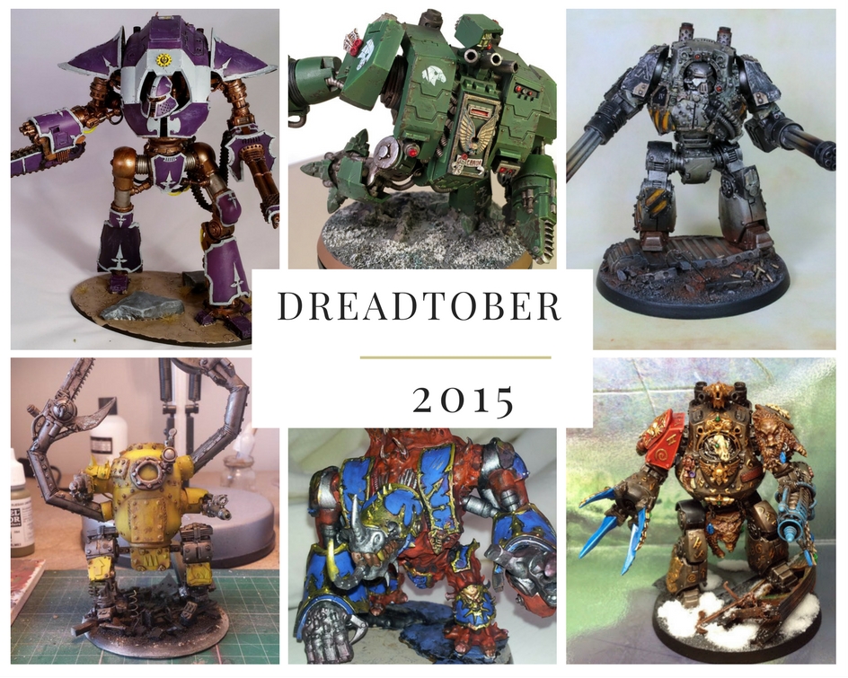
Models by Mordian7th, Adam, Swelter, Blaz from 2015 Dreadtober

Models by Mordian7th, Adam, Swelter, Blaz from 2015 Dreadtober

I hinted at it above, but the goal of this challenge is to paint a dreadnought-sized model in the month of October. By teaming together with a bunch of other hobbyists, we can lean on each other to finish milestones, try new things, and overall improve our painting skills and have another model finished.

Last year, nearly 50 people officially took part with the majority of them finishing their pledge. It was the community aspect that I enjoyed watching last year (though I never actually joined the challenge). And it’s that same community aspect that I hope to bring back this year.

What to Expect

So, what is going to happen this year? I am running it a bit different and adding my own touches to the challenge, but the goal is the same: start and finish a dreadnought sized model in October.

Weekly Challenge

I’ve decided to break it down into six weekly challenges that create manageable steps. The six weeks wasn’t a math error, but rather the challenge will start September 25th with planning and end November 5th with the final Showcase post.

The weekly breakdown will be:

  1. Planning and Prep: get ready for the month
  2. Build: cut, glue, hack, and get your dread assembled
  3. Main Paints: all the primary colors, layers, and shades
  4. Construct and paint the base: add a cool base, or catch up week
  5. Paint the details: decals, weathering, details – finish the model
  6. Photography: learn some new tricks to get the best picture of your work

Each week will include the challenge description with links to tutorials, a brand new tutorial I’ve put together, and a weekly Showcase where I will post up everyone’s picture from the week.

Social Media and Blogs

All month long I will be encouraging everyone to post their progress on social media, your blogs, and any other forums you usually use. This way we can help each other out when we get stuck or provide feedback on something new you are trying.

For the #hashtaggers, use #dreadtober to help others find it. Also, spread the word about the challenge to get your friends involved.

Join the Dreadtober Mailing List

To make it easier to contact everyone participating in the challenge, I’ve set up a new mailing list. It’s as simple as adding your name and email below. I won’t share the email with anybody (even other members), so it’s safe.

Dreadtober 2015 Participants Grenn, Tibbs, Jame, Jason, Rory, and NafNaf

Dreadtober 2015 Participants Grenn, Tibbs, Jame, Jason, Rory, and NafNaf

Being on the mailing list provide a couple of benefits (for you and me):

  • I’ll send you the weekly challenge Saturday morning
  • Request for pictures for the showcase on Friday
  • And a way for you to contact me with any questions or your pictures

What Can You Do Today

After all that, did I get you excited? Awesome! I’m pumped too. But before we get started, I need you to do two things:

1. Are you In?

Decide if you are going to join in. Even though it’s a single model, partaking in any challenge can be a good amount of work. I hope you are willing to jump in and join us as it’ll be worth it.

If you decide to join us, decide what model(s) will you finish over the month. It’s not set in stone, and there is no competition. So think about what you could finish in the month of October.
Then sign up in the form below so I get you on the mailing list.

2. Invite Others

The best thing about Dreadtober is being part of the community challenge. So ask all your hobby friends to sign up. Share this announcement on social media by clicking the colorful boxes. Point them to https://www.brokenpaintbrush.com/dreadtober which will always point to the latest post.

The more people who sign up, the more diverse and impressive result we will get by the end.

More to Come

I am excited to be kicking off Dreadtober very soon. So stay tuned for the first challenge post going live September 25th – or better yet, September 24th to your inbox if you signed up below!

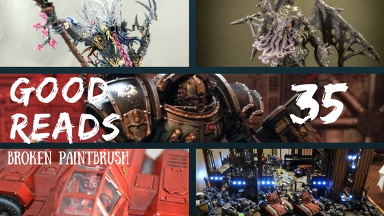
Good Reads 35 by Broken Paintbrush

Good Reads 35

It’s time for another selection of amazing posts from your fellow hobby bloggers. You don’t want to miss these Good Reads.

Good Reads 35 by Broken Paintbrush

Treelord Ancient

Treelord Ancient by Turkadactyl

Treelord Ancient by Turkadactyl

The new Sylvaneth (treemen) are some amazing kits and if I didn’t have just a huge backlog, I would have jumped in on their release. But Turkadactyl is going full bore with his trees, painting them in a bright spring color scheme, complete with cherry blossom pink.

Reaper Minis

Eldritch Demon by Sean

Eldritch Demon by Sean

You may remember Sean’s post on Oldhammer, but it’s not just old Citadel models he pines over. He posted up his collection of old Reaper minis full of old-time character but with great, modern painting.

Xiphon Interceptor Complete

Xiphon Interceptor

Xiphon Interceptor by Gothmog

Forge World makes some great looking flyers, even Space Marines get flyers that look like they could actually fly. Gothmog painted up a nice Xiphon Interceptor for his Blood Angles that looks brilliant in all that red.

Iron Circle

Iron Circle by Xach for the Iron Warriors

Iron Circle by Xach

I am a long time Iron Warriors fanboy, and of course picked up Angel Exterminatus. The Iron Circle was only mentioned a few times but they sounded so cool. The recently released models by Forge World are awesome, but Xach depicted one brilliantly with some awesome weathering. (oh he has a Warsmith on there too!).

Nova Open Picture Dump

img-6141_orig

Leave it to Greg to kills thousands of collective hours by fellow hobbyists staring at his huge picture dump of Nova Open. There are some fantastic armies in there worth spending the time to check out.

Wrap Up

I hope you enjoyed this week’s Good Reads and found some new things to check out or inspire you with your own projects.

As ever, if you want to add your own two cents on a Good Read I might have missed, leave it in the comments below!

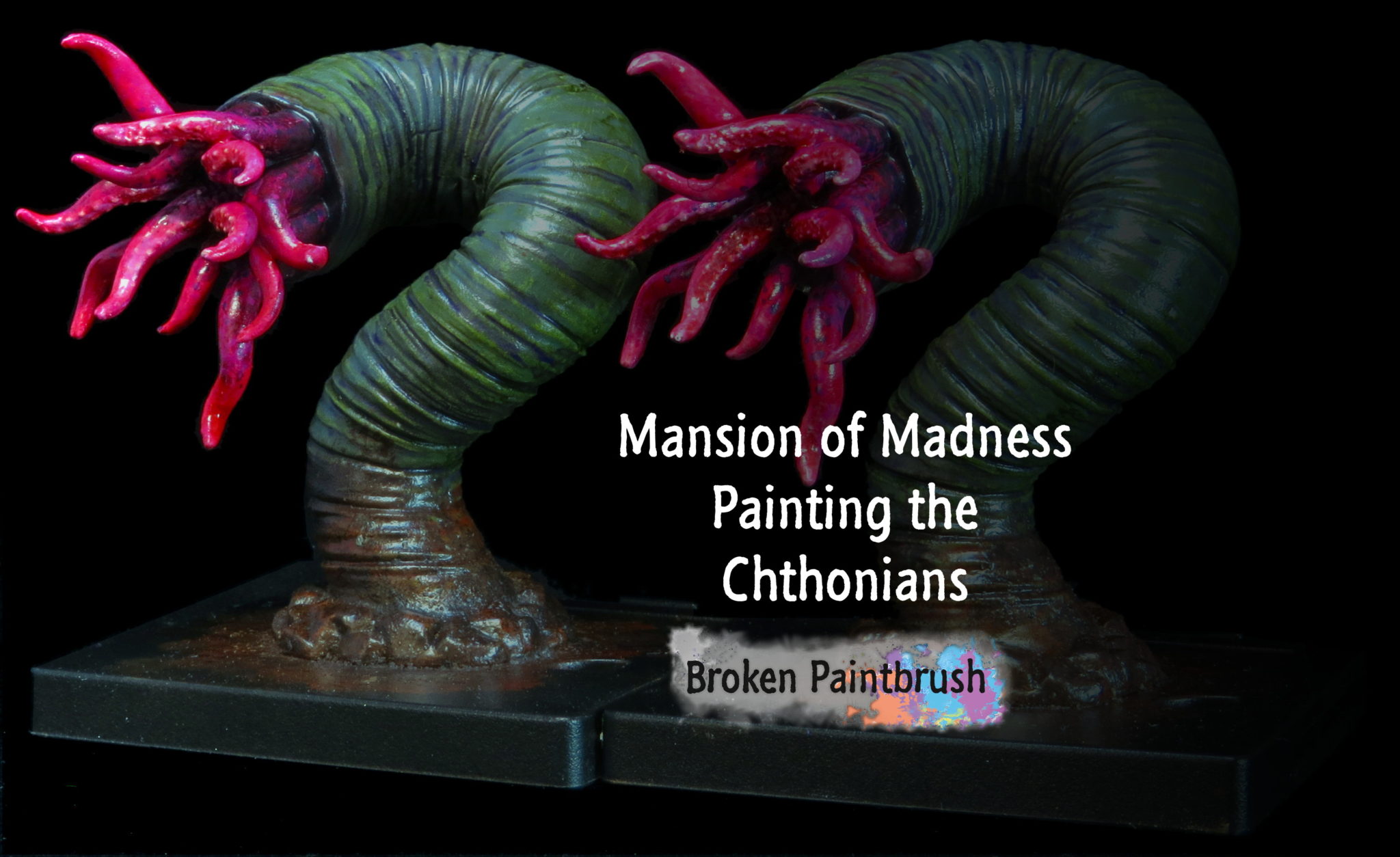
Painting Guide for the Chthonians from Mansions of Madness

Chthonian Painting Tutorial for Mansions of Mansions

One of the scarier monsters of the game, the Chthonian are otherworldly monsters that appear from nowhere and swallow up the investigators.  Below I’ve put together a painting guide on how painted these beasts.

Painting Guide for the Chthonians from Mansions of Madness

Chthonian Painting List

When I painted the Chthonians, I was going for a contrast: ‘natural’ colors for the main skin and strong colors for the tentacles. With that, I’ve put together the paints used before for reference

  • Game Color Sombre Grey
  • Game Color Wolf Grey
  • Game Color Dark Green Wash
  • Game Color Royal Purple
  • Game Color Charred Brown
  • Game Color Tan
  • Game Color Warlord Purple
  • Game Color Squid Pink
  • Model Color Basic Skintone
  • Model Color Scarlett Red
  • Game Color Black

Painting the Chthonian Skin

For the skin, I started with gray dry brushes followed up with green and purple washes. This helped to create something that looked almost natural.

Base Colors

Chthonian from Mansions of Madness painting base colors

As with all my models, I paint the main colors so I can get a  sense of proportions between each block. The main body was done with Sombre Gray, the tentacles with Warlock Purple and Squid Pink on the inside.

Dry Brush

Chthonian from Mansions of Madness painting grey drybrush

I then took a dry brush of Wolf Gray over the body to highlight all the ridges.

Green Wash

Chthonian from Mansions of Madness painting green wash

I then used a green wash to create an ‘oddness’ while simultaneously shading the skin.

Purple Wash

Chthonian from Mansions of Madness painting purple wash

To accentuate the oddness and deepen that shadows, I used a purple wash. While the green was a general, dump it everywhere wash, the purple was selectively added to the deepest crevices.

Finishing Touches

Chthonian Painting Guide Finished

The last bit added to the skin was bringing it back into the base. So using Charred Brown, Tan, and weathering powders. I wanted him to seem like he just burst out of the ground and dirt spreading everywhere.

Painting the Chthonian Tentacles

I wanted the tentacles to be extra creepy. Something to draw focus and give them an extra scary. I built up from purples and pinks.

Base Colors

Chthonian from Mansions of Madness painting basic skintones

The main tentacles were painted with Warlord Purple while the inside was painted with Squid Pink. I then went back and highlighted the sucker pads with Basic Skintone.

Red Wash

Chthonian from Mansions of Madness painting red wash

A red wash was then used to tie all three colors together.

Purple Dots

Chthonian from Mansions of Madness painting purple dots

I then wanted to add something extra to the tentacles. So I took the Royal Purple used as a wash for the skin and used it as beauty marks at each one’s base. I kept them larger and more grouped towards the base of the tentacle and spread them out as it moved towards the middle.

Black and Purple Dots

Chthonian from Mansions of Madness painting black and purple

I then added a bit of black to the purple and colored in some of the dots near the base.

Finishing Touches

Chthonian Painting Guide Finished

The final touches included using WarColours Fluorescent Pink. This gives it a brighter, shiny look.

Chthonian Showcase

And that’s it, two Chthonians painted and ready to devour the world.

Painted Chthonians

I hope you enjoyed this painting tutorial and the crazy Chthonian monsters don’t give you too many nightmares!

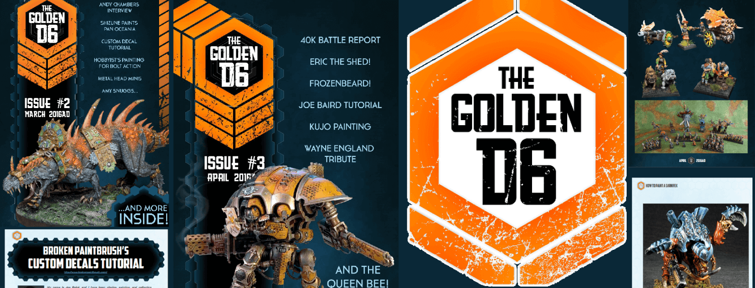
Guest Interview with Adam Jones of The Golden D6

I have a special guest interview as today’s guest post. One of the great things about our hobby is being able to connect with so many people all over the globe. And almost exactly a year ago I wouldn’t have been able to tell you anything about Adam Jones.

Adam Jones and the Golden D6

Until out of the blue, he reaches out to me on Twitter saying he has a crazy idea of building an online hobby magazine. In this last year, Adam has since released 6 amazing issues, packed full of hobby articles from your fellow hobbyists.

You can check out my review of Issue 3 or Adam put together a special pack of the articles that I’m featured in, you can fill out the form below and download a teaser!

Interview with Adam Jones of The Golden D6

Tell us a bit about your hobby?

The Golden D6 used to be my regular gaming group and we’d meet on a weekly-ish basis to get out Warhammer 40000 on. At the time, the Melbourne 40K tournament scene was a vivid and lively place to play with a mix of gentlemanly sportsmen getting together to figure out who was the best 40K general. This was the age of Rogue Trader and things were good.

Farseer Painting Tutorial by Adam

All good things must come to an end, unfortunately, and circumstances change for players who drift in and out of the hobby. So it was for the Golden D6 Gaming Club. Various attempts have been made to resurrect the garage, but none quite took the same as that halcyon era.

As I have grown up (sic: older), I wax nostalgic about times gone by and how young people today don’t play 40K like we used to. “10 attacks on the charge was good enough for me.”

In more recent years with a son, a newborn baby and my wife needing two major back surgeries in the space of twelve months, my hobby time became a lot more scarce. Painting and playing took a back seat to poopy nappies and convalescence.

My hobby became vicarious as I frantically consumed content from blogs and forum posts. I’d have discussions with people about such and such a post on this or that blog only to realise that I was the only reading some of this amazing content.

Where did the Golden D6 Come From?

One day I was listening to a podcast where the presenter interviewed a guy who started an online magazine and was getting quite successful at it. I remember thinking, I can do that, but what am I interested in enough to devote that much time to?

Between nostalgic longings and general obsession with toy soldiers, twenty-five years give or take, GD6 seemed like a great idea. I was massively interested in the topic and curious about going beyond my, largely neglected, blog.

Knowing that there was no way I would be able to devote enough time to produce an entire magazine worth of content I began to look at a more abundant source of material: the internet. My Feedly blog roll was near three hundred entries long and I began to pore through the list to find cool stuff that I thought other hobbyists would be interested in. I also hassled all my gaming mates and Facebook groups about what sort of thing they were interested in. Before too long, I had enough blog and forum posts collected together.

What started out as vicarious hobbying had morphed into an online magazine.

I’ve been an internet nerd for a while now, and knew a thing or two about putting together a website. That was the easy bit. Putting together the articles into a magazine format was a nightmare! I have NO design skills whatsoever; just take a look at Issue One compared to Issue Two! However, I slaved away over a boiling, hot keyboard to mash together Issue One enough to be happy with the end result.

How did it feel to release Issue 1?

Golden D6 Issue 1

When I finally hit “publish” on that first issue I was really excited. Here was my first foray into online business and I was going to make a million dollars overnight with no work at all.

If you actually believe that, drop me an email. I have a bridge I can sell you.

It was still exciting to get something out there. When I was a kid, I wanted to be an author. Or a veterinarian. While neither of those dreams has technically come true, seeing “my” work out there for all to gander at was amazing.

In the first three days, I gave away more copies of Issue One than I sold. It was more important to me that people saw it than people bought it. That wasn’t sustainable because hosting cost, software costs and it’d be nice to have a bit of pocket money along with the work. However, feedback coming in was positive and I was on the right track, I felt.

Where did you go from there?

Then I took a six-month break between Issue One and Issue Two.

When running a business of any type, closing the doors for that long is a bad idea. When it’s a periodical magazine, it’s pretty well suicide. I’ll cite family reasons as a convenient excuse.

Golden D6 Issue 2

Still, I was determined to make this thing work and so I began to collect more material for Issue Two. As I said before, “NO design skills”, so to plug that hole, I was extremely lucky to get back in touch with Matt Weaver, ex-White Dwarf editor and design super genius, to do the layouts for me.

Looking at the two issues, there is no comparison between Matt’s super-fine designed and laid out Issue Two and my Issue One that looks like I used a crayon stuffed up my nose (metaphorically) to put it together. The investment was well worth it as Matt’s skills filled a massive hole in the creative process. I PROBABLY could have reached the same lofty heights he took Issue Two to.

You’d still be waiting for it though.

What has been your favorite issue?

If I had to pick a favourite issue, it would have to be issue one. The lack of refinement aside, it represents me doing something that I’ve never done before.

Golden D6

I am an inordinately slow and meticulous painter and over-fixate on getting things exactly right. Rather than trying to get the Golden D6 absolutely perfect, I went live with Issue One knowing it was not perfect (and never would be).

Knowing what I know now, I could go back and refine Issue One to bring it more in line with all the other issues. I think I’ll leave it as is as a reminder to me, if no one else, of how the Golden D6 has evolved.

I also really like Issue Five as it was the first issue since Issue One that I did all the layouts for, using Matt’s spectacular templates to do the layout. Oh, and Issue Two, where some people MIGHT say, (tongue in cheek) the Golden D6 discovered Amy Snuggs’ amazing Seraphon (Lizardmen) army.

What does the Golden D6 offer for readers to buy?

Why would anyone buy the Golden D6? Why? Well, I’m something of a big deal, don’tchaknow. Heh.

I’m not going to delude myself and think I can get stuff out faster than other forums and blogs (there are any number of news sites that put out content at a ridiculous rate). What I am doing is curating awesome content to present it to readers.

Hopefully, some, if not all of it, is stuff that the average gamer wouldn’t normally come across.

I found, for example, this one guy with a blog who writes some great tutorials for beginners through to advanced hobbyists. The name eludes me … erm … smashed paint stick or something. You can find all the stuff that I’m curating for the Golden D6 yourself, but I’m making it easier for you.

What makes the Golden D6 special?

I’ve been playing with toy soldiers for about twenty-five years. Without doing ANY additional research, that makes me the oldest, most experienced wargamer on the planet. After doing something for any period of time, you’ll develop a skill in that area.

I think I eyeball some awesome content for the magazine. As a trainer in real life, I’m a huge fan of tutorials and there are some awesome, well-written tutorials out. I kinda love being able to find this content for my readers.

Adam Jones and the Golden D6 #6

Issue Six was the “all tutorials” issue. So far, it’s had the strongest uptake of any of the issues. In the future, dedicating an issue to one particular game system or one type of tutorial (painting for example) is a possibility too.

I’m learning more and more about interview techniques from people like Rob at the Paid to Play podcast and I’m looking forward to talking to more “celebrities” in the wargaming world.

If you could get someone to write an article, who would it be?

I’d love to talk to Jes Goodwin again. I hung out with him years and years ago at the first Australian Games Day and he is kind of iconic when it comes to Warhammer 40000.

I was lucky to talk to Andrea Sfiligoi, who wrote the awesome game A Fistful of Kung Fu, and I can’t recommend the game enough. It’s amazing some of the games and people who are out there today and so cool to be able to talk to them.

How can others submit articles for the Golden D6?

One of my favourite things about The Golden D6 is getting content from the community. I can dig through blog after blog and

I can dig through blog after blog and the near infinite number of forum posts, but I really like when people bring me their own stuff. I can look at a blog and find something that jumps out at me, however, I’d rather someone presents me with something that they’re especially proud of.

The same goes for anyone who wants to write for the Golden D6. It’s a bit of a secret, so don’t tell anyone; I have no idea what I’m doing and am figuring it out as I go! As far as guidelines on submissions, it’s pretty simple: make it awesome.

Email me at thegoldend6@spruegrey.com or find me on social media @spruegrey.

Most mobile phones have amazing cameras on them and getting lighting right isn’t hugely difficult (I made a serviceable light box from a washing powder box!), so producing high-quality photos isn’t too hard. After that, take as long as it takes to tell the story you need to tell. Be as verbose as you like, I can always edit anything that I think is too long.

Apart from that, there’s no other limits on my guidelines. Make it awesome, tell a great story, take great pictures.

I’m under no illusions that the Golden D6 lives and breathes because of other people’s help and it has been a massive amount of fun so far. I am thankful for everyone who has helped me so far and looking forward to continuing my work with hugely talented wargamers out there.

Thanks Adam!

It was fun getting a peek into what make Adam Jones tick and why the Golden D6 came to be.

If you want to read some reviews on it, I wrote up a review of Issue 3 and Wargame News and Terrain wrote up a review of Issue 6.

UPDATE: Adam reached back out to let everyone know that if you use the coupon code ‘brokenpaintbrush‘ you will get 25% off! The code will only work until September 30th so grab a copy of issue 6!

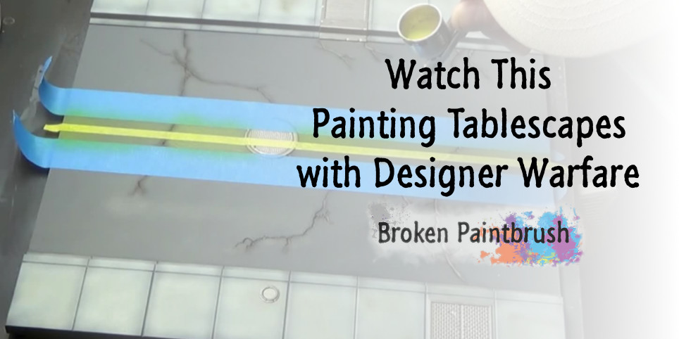
Watch This: Painting Tablescapes from Secret Weapon Miniatures

Watch This: Painting Tablescapes from Secret Weapon Miniature

Another new video is ready for Watch This series, this week is with Designer Warfare and painting Tablescape Tiles from Secret Weapon Miniatures. He paints up a few sections of the Urban Road (Clean and Damaged) with his airbrush for our enjoyment.

Watch This: Painting Tablescapes from Secret Weapon Miniatures

I’ve been looking at picking up some of these Tablescape Tiles for my own gaming table and found this video super helpful. I hope you enjoy his fairly quick video on painting the streets and check out my cheat sheet notes below for later reference.

Quick Reference for Painting Tablescapes

  • Due to the manufacturing, some tiles may have variations in the plastic color
    • Doesn’t affect the physical nature and is easily covered in primer
    • (large plastic injection molding is hard and can leave harmless ‘sunbursts’ in plastic)
  • Prime each tile with Grey Primer
  • Use Model Air Pale Blue Grey, focusing on the sidewalk areas
    • Keep some variation in the spray to add interest in each tile
    • Avoid the cracks and recesses
  • Paint craters with Army Painter Oak Brown
    • Start at center of each and work outwards
    • Avoid the rocks and debris
  • Add soot to craters with Model Air Black
    • Thin 1:5 to make it more like a transparent ink
  • Spray the largest cracks with thinned down black to add shadow
  • Handpaint all the metal areas with Army Painter Gunmetal
    • Be careful near the edges not to get it on the roadway or sidewalk
    • Rotate the tiles to make it easier to use the brush
    • Thin paints about 1:2 with airbrush thinner
  • Spray Secret Weapon Miniatures Concrete Wash to shade
    • Used over large areas to add variation
  • Mark the center of the road with a tape measure and marking it with water
  • Apply the 1/4″ masking tape along the center line
    • Double check each side and adjust as needed
    • Cut tape against center details like manhole covers
    • Actually recommended doing center stripes before weathering (lessons learned for you!)
  • Add 1″ painter’s tape to each side,
    • make sure it is 1/4″ away from center tape
    • Again, cut and press tape around raised features
  • Spray with Army Painter Demonic Yellow
    • Next time he would use more of an orange-yellow
  • Once yellow is dry, peel up the paint
    • Pulling it back against itself
    • May need to use knife to remove smaller pieces on raised sections
  • Re-apply wash to cracks along the yellow stripe
    • Wouldn’t need to do this if yellow was painted earlier
  • Apply Secret Weapon Armor Wash to metal areas
    • Stipple it around the surface to keep it uneven (more interesting)
  • Weather metal using AK Interactives Light Rust Wash
    • Add one large pool to certain areas and stipple outwards
  • Apply a Matte Clear coat to everything
    • (I would do about 4 on these gaming tiles)
  • Estimated 15 hours to paint the original 4 tiles
    • But only 5 hours for the other 8 (still has a bunch to go!)

Wrap It Up

I hope you enjoyed this Watch This video with Designer Warfare on Painting Tablescapes. You can check out his YouTube channel for more videos and give him a follow.

Have you painted up the Tablescapes sets? I am interested in how others have done it and how they work with various building manufacturers (Games Workshop, Pegasus Gothic, Mantic Deadzone, etc). If you have a post or pictures you can share, hit up the comments below so we can check it out!

Dreadtober Painting Challenge

Dreadtober is Coming

Can you believe August is already over? That brings a few things: the end of summer for us in the north, Nova Open, and anticipation for Dreadtober! Due to exciting things in Greg’s life, I’ll be hosting the month-long painting event this year, and it’s going to be awesome! And Lo! Dreadtober is coming!

Dreadtober Painting Challenge

Photo/Drawing/Logo by Todd @ Sincain40k

For those who missed it last year, Dreadtober is a community challenge to build, paint, and show off a dreadnought sized model during the month of October. There isn’t any competition or reward other than getting one of your models finished. But the participants had a blast last year and some amazing models got painted.

I’m still working on the details for the challenge, but if you are interested, sign up below and I’ll keep you up to date. I’ll be using email to keep in contact with all the participants, but don’t worry, I don’t spam and I won’t automatically add you to the newsletter (though I hope you check that out too!).

Stay Tuned for More to Come!

A more formal announcement will be coming out in a few weeks, but tell your friends, tweet it out (#dreadtober), and share your ideas at Nova Open. I know I’ve got some KillaKans and a Mentors Dread in my bits box that need some paint.

Until then!

How to paint white skin and faces

How to Paint Light Skin – Broken Paintbrush Tutorial

Painting skin, particularly faces can be a challenge for beginner painters. Or even those, like me, who have been painting for years but never ‘got’ how to paint flesh. To learn, I challenged myself to create a tutorial on how to paint light skin.

How to paint white skin and faces

Much of this came out of creating a painting tutorial for each of the Mansions of Madness models. I’ve already done the tutorial for the dark skin models, so now it’s only fair to do the same for the light shades of skin.

Below you will see I took five bare heads and tried slightly different techniques on each. From fast and dirty dry brush to only using washes to trying to do something more ‘advanced.’

Paint List

Below are the paints I used for all five faces.ost of the colors came from Vallejo’s Skin Colors Set that I would highly recommend picking up.

  • Game Color Heavy Skintone
  • Model Color Sunny Skintone
  • Model Color Basic Skintone
  • Games Workshop Reikland Fleshshade
  • Game Color Flesh Wash
  • Game Color Red Wash
  • Model Color Brown Rose
  • Model Color Dark Flesh
  • Model Color Bone White
  • Game Color Blue Wash
  • Game Color Warlord Purple
  • Model Color Mahogany Brown

Quick Methods

The first two methods are what I would consider quick or easy methods to paint light skin. But don’t discount them because, as you will see, you can get some decent looking faces from these techniques.

1. Painting Light Skin with Dry Brush Method

The good ol’ dry brush method to painting skin.

The idea with dry brushing is you load up a stiff brush and wipe most of the paint off with a paper towel. You can the knock the bristles about on the model, and it leaves paint on the raised edges.

It’s quick and easy and works ok for painting skin, but does leave it looking a bit dusty (which we will address in method #3 below).

Painting white face using a dry brush basecoat

The first step is to paint the base color onto the model. As the dry brush only builds up layers, it’s important to have the base color be darker than where you want to go.

Here I painted all the light skin with Heavy Skintone which is a dark, reddish brown. I then used two sets of drybrush to build up the highlights: Sunny Skintone and Basic Skintone. Using the dry brush I could quickly grab all the raised edges of his face and lighten it up.

Painting white face with a dry brush

The other downside of dry brushing is that it makes a mess. So I went back over the other details and cleaned them up, painted the eyes, and added some dark brown wash to his open mouth.

From start to finish in only a  few minutes. It’s quick and dirty but makes for fast painting.

2. Painting Light Skin with Wash Only

The next guy I painted his face with only washes. This is another quick way to paint models in the sense that . I go on so quickly and seep into the recesses.

It has two challenges: the washes take a long time to dry, so you need breaks between each session. And you have to be extra careful when painting the details around where you are washing.

Painting White Face with washes only - step 1

Flesh Wash, Reikland Fleshshade, red wash

After painting his glasses, bandanna, and hair, I slathered him in Flesh Wash. I was a bit disappointed with this wash as it was extra thin and it took two coats to get what you see in the first picture.

So instead, I went back to Games Workshop’s Reikland Fleshshade, which provides a warm brown shade. To add more interest to him, I added a red wash on his bottom lip and in some of the recesses. This adds more color to his face as I can image this guy working hard to make that frown.

3. Painting a White Face with Dry Brush and Wash

As I mentioned in the dry brush method, it can leave the model looking a bit dusty. To fix that as well as bring some of the shadows back, I added a final wash step to face #3.

Painting light skin with dry brush and wash base

I also went for larger contrast through the steps by starting with Brown Rose as a darker base. Dark Flesh and then Bone White were dry brushed on. I went all the way to white so the wash could leave highlights.

Painting white skin with drybrush and wash

Reikland Flesh Shade, Blue Wash, Warlord Purple

So I cleaned up the bandanna, painted his eyes, then used Reikland to tone him back down. This provides for a nice face with little work, perfect for the pile of Guardsmen facing you from the gray tide.

I wanted to play around with him a bit more and add bruising or pox marks. So the Blue Wash was broken out and added beneath his eyes, lower lip, and side of his face. In hindsight, I could have added a bit of skin tone over the large blue splot and made for some convincing bruises.

Instead, I accentuated it with Warlord Purple. By adding it to the lower lip, it made it look puffy and bloody, while the dots on his face ended up more like track marks. But that is part of the idea of doing these practice faces, try something new, take notes, and do it differently next time.

More Detailed Methods

On the next two faces, I went with the more ‘sophisticated’ way of using layers and glazes. Rather than using a dry brush to smash paint onto the highlights, I used smaller brushes to apply the paint to where I wanted to.

It does take longer, much longer if you want to get fancy, but you can add more depth of details where that may not exist on the actual sculpt.

4. Painting Light Skin with Layers

First up was Harvey Tall Hat. One of the important things about painting light skin is keeping it warm. Using too light of colors or adding grays can make it too cool and dead looking (unless of course, that is what you are going for!).

Painting white face with base colors

To that end, the basecoat of Heavy Skintone is a warm, dark base. It provides a nice foundation for the recesses. Sunny Skintone was then layered onto the upper and flat areas. The idea is to leave some of the former colors in the recesses and paint thin layers over them.

By using thin layers, it may take a couple of coats, but if you bring the second coat in bit further, it creates a smooth edge between the colors. This was done with the Basic Skintone to add more highlights.

Painting white face with layers mid tones

To bring the layers back together, I added a wash with Reikland. It was a thinner wash than I used on the models above as I didn’t need to darken it much. I also went and painted back in all the details as I had now finished the messy parts.

Painting white face with layers finished

To try something different on this guy, I decided to add a beard. I must admit, the first attempt (on the left) turned out a bit awful. Well maybe not terrible, but rough. I started with Mahagony Brown as a thinned down layer. Sticking to the lower face, chin, and upper lip I spread what now looks like mud over his face.

To fix this situation, I added a second layer of Charred Brown. I went with a dark color because it provided more contrast than the mahogany. Making it look like it should be there rather than odd shading.

5. Painting a White Face with More Layers

On the last guy, I added more layers, a wash, and more layers. This is where it is starting to get past my personal painting level, but it’s important to try new things and grow right?

I apologize in advanced on the sheen in the first few pictures. The Brown Rose and red dried rather glossy. Next time I would have hit it with some matte clear to make it easier to photograph and paint.

Painting white face with detailed layers base

The steps are the same as #4 above, I just started with darker tones for the first layers. So Brown Rose, Dark Flesh, and then Sunny Skintone were layered on the raised areas.

You can see that I left the darker colors on the bottom side of his cheekbones, lip, and eye sockets. This is something that is much harder to do with the dry brush and wash methods as the plastic doesn’t stick out as much on some of these areas.

Painting white face with detailed layers mid

Reikland Flesh Shade, Dark Flesh

His whole face was then washed with Reikland. After the first wash had dried, I added selective areas with a second layer, including around his lips, ears, and eyes. It looks like a bit of a mess around his mouth, but I fix that with a new layer of Dark Flesh.

The added layer picks back out some of the smaller details and provides interest. Such as his upper lip, I didn’t paint it as a straight line. Rather, I highlighted a couple of spots to make it seem his lips are a bit scared. The highlight also pulled out his lower eyelid and eye socket.

Painting white skin with more shades

To create more interest in this guy, I added some bruising around his eye patch. It started with a blue wash built up a few layers. This was followed by a mix of Red shade and Warlord Purple to deepen it. Unlike guy #3 above, I kept it to small lines.

I then added a second wash of Reikland Shade, but kept it to the areas I wanted more shading. So around the mouth lines, under his cheekbone, and eye sockets.

Painting white skin finished

To finish this guy up, I went back with the Dark Flesh and thinned it down with Airbrush Medium (fantastic stuff). I added this back into the highlight areas that had too much wash or bruising added. Just like the first cleanup layer, it was the top of the cheekbones, lower eyelid, upper lip, and chin bones.

Painting Light Skin Wrapup

I hope you enjoyed this tutorial on painting light skin, and that you checked out the dark skin version as well. Painting faces can be tough, but with some practice (like I did above), you can make rather convincing faces even with a dry brush.

Some basic takeaways for your own faces:

  • Start with just a dry brush and add a couple of layers
  • Try adding a flesh wash
  • When you are ready, use layers to add more interest to the face
  • And add some color with washes like red and blue

See How to Write an Effective Article Title

There are a lot of stats explaining the value of an article title. I won’t bore you with them, but suffice to say the article title plays an enormous role on people choosing to read the article or not. We all do it, choose to pass on an article because of its headline, or opt to read it. It’s something we know about, at least subconsciously, but very few take it into account when creating their article.

How to Write an Effectivev Article Title

Thor is back for improving our blogs. Why? Because with some simple adjustments, it can significantly improves who finds you and how long they stay. Thor’s experience has given him insight for what works for hobby bloggers.

Why Bother?

As noted above, the big reason for taking the time to write effective, eye-catching headlines is to get your article read. That may seem obvious, but let me explain.

Do you use Facebook? How about Twitter? Many of us have a large feed of stuff we scroll through every day on social media. I don’t have the time to read every single thing I see on social media, and I’m sure you don’t either.

What do I read then? Well, the stuff with catchy headlines typically, and I bet you do as well.

Those catchy headlines are also the type to get more likes, shares, etc. In turn, further increasing your reach with your article.

The same is true of blogrolls. Many of us bloggers have blogrolls to promote those blogs we enjoy reading. A fair amount of blogrolls will only show the headline, no image to accompany it, so it’s up to your headline to catch the eye of a potential reader and draw them in.

So, the reason to bother putting the time and effort into creating good headlines is to increase the amount of people who read the article you spent hours crafting.

Blog Post Headline Analyzer

Recently I’ve discovered this great tool for writing article titles. It’s the Blog Post Headline Analyzer by CoSchedule.

The analyzer covers a lot of bases. In short, this tool will give you a numerical value for your article title. It will weigh several factors, like the words used in the title, the type of title it is (how to, list, question or generic), and more.

The other great thing with the analyzer is that you can get explanations for each component. So, you aren’t blindly trying different titles to increase your score. You can see why you have the score you do and how to improve it.

Headline Analyzer

Non-Generic Headlines

Now, a big focus with the analyzer is to not use a generic article title. Based on the type of blogging we hobbyists do, generic titles are common. A non-generic title would be like the one I used for this article “See How to Write an Effective Article Title”. That title is considered how to for obvious reasons.

Other non-generic types include a list like “Top 10 Mistakes in Writing Article Headlines” or posing a question like “How Do I Write Better Article Headlines?”.

Do those type of titles all look familiar? Of course they do! Nearly every single article title you see plastered on Facebook and social media looks that way. The fact is, those titles work, as lame as it may appear.

How to

Generic Headlines

Rarely do we wargamers have the chance to write those type of headlines, non-generic. Instead, we’re doing things like “Daemons vs Space Marines Battle Report”, or “Painting a Tactical Squad”.

The tool has value for the generic headlines because of those other factors it looks at, like the type of words used in the headline, the length, etc. Also, generic headlines aren’t inherently bad. It’s all a matter of what you’re writing. Don’t feel like you have to force a title to fit into a non-generic type.

Make it Interesting

Ultimately, just make your title interesting. Look again at this one: “Daemons vs Space Marines Battle Report”. It clearly explains what the article is about, and people will click it for sure. But, it can be better.

How about “Death of an Empire: Daemons vs Space Marines Battle Report”. It sounds cooler, and should pick up a few more readers just because it sounds less generic and adds interest. Generic headlines don’t have to be plain and uninspiring.

Think About Search Engines

The other thing you have to think about with your titles is search engines. I won’t dive into SEO (search engine optimization) value for your article titles, but instead human nature.

When writing an article title, think about how someone would search to find your article. This is what makes those how to types very effective. If I want to learn how to airbrush then I might search for “how to airbrush for beginners”. This, in SEO-land, is what we call a long-tail keyword search; a search term with more than 2 words.

Those are the type of searches people are performing; searches specific to what they need. I wouldn’t just search for “airbrush”, that’s too broad. I might search for “airbrush beginner”, and probably get some relevant results. But, if I structure my search very specific, “how to airbrush for beginners”, then I know the results are going to be extremely targeted to what I want.

Keep this in mind when creating article titles, how people will try to find what you’re writing about.

Search Engines

It Works

Since discovering this headline tool, I have gone back to older articles and updated their titles. I only bothered with the articles that I know get a lot of traffic, like the tutorials and reviews. I have noticed a reasonable increase in the traffic those articles get now.

The big increases have been with the tutorials, and that’s because they fit into the how to category. I had those titles, I thought, SEO friendly already, and they were.

For example, one tutorial was “Liquid Green Stuff Gap Filling Tutorial”. The title hit all the keywords I was after, and did pretty well in search engines. I since changed the title to “A Guide on How to Use Liquid Green Stuff” and it’s had a noticeable increase in search engine traffic because it’s more in line with how someone would search for such an article.

Keywords in Headlines

Relating to search engines, and a quick SEO note, is keywords. The long and short of it is this. Write article titles with keywords. Keywords have value to search engines, but also to potential readers.

Take this title “Thor’s Workbench”. I’ve created titles like that, and I’ve seen many article titles like that. That title, however, has little value to a reader, and even less to a search engine. I mean, who is going to do a search for “Thor’s Workbench”? The only people who would bother clicking on that article are those who know me, which isn’t a very large group.

Instead, if I did an article title like “Painting a Chaos Knight Titan”, now I’ve got some keywords going: painting, chaos knight, titan; the things people will be performing searches on. Pretty obvious which article title would get more click-throughs I think.

Keywords

In Conclusion

Hopefully, I’ve given you some things to think about the next time you write an article. You don’t have to write super lame headlines to get people to read your article, but you do have to consider what’s more likely to interest someone and get them to read the article.

Don’t be afraid to use those lame sounding headlines either. They work, it’s a proven fact, so if it’s applicable to you then use it, like I did here. You’re not a sell-out if you create an article title that attracts more readers, you’re just someone adapting to the environment.

Broken Paintbrush Good Read 34

Good Reads 34 – Blood, Deff, Magnets, Slaughter, and Wolves

Too busy to keep up with all the hobby awesome over the last two weeks? Then check out this week’s Good Reads! I’ve found an awesome lineup including Greg’s amazing Deff Dread, planting blood and gore, and more awesome articles by fellow hobbyists.

Broken Paintbrush Good Read 34

Blood and Acid Tutorial

Broodlord by FantasyHammer

Broodlord by FantasyHammer

I shared The Fantasy Hammer’s Broodlord last time, but he returns with a great tutorial on adding gore and slime to your models. He makes it seem so easy, but with the right tools it probably is.

Slaughtersmith

Slaughtersmith by Thomas

Slaughtersmith by Thomas

Combining fantasy (or Age of Sigmar I guess) models into the 40k world can create some awesome characters. Thomas took the Slaughterpriest and created a custom Warpsmith for his army. Shows what you can do with spare bits and some guitar string.

Magnetizing a Knight

Magnetized Knight by Corrm

Magnetized Knight by Corrm

Mike has finished up his White Scars (only for the moment, I’m sure!) to build up a Knight Titan. But he wanted to do ALL the knight types… Solution: magnetize every bit of the Knight. He shows how with a ton of pictures so you can give it a try as well.

A Dread Above All Others

Deff Dread by Greg

Deff Dread by Greg

Nova Open is having their annual raffle to raise money for Doctors Without Borders (buy tickets to win an army!). Each model is painted by awesome people like Greg who spent countless eons adding about a billion layers to the Deff Dread above. Seriously, check out the finished model, then read his WIP posts – epic stuff.

Squashing Rumors With A Teaser

I’m normally not one to spread rumors about new releases that may or may not be coming out soon. I find them distracting at best, and disappointing at worst. But when the guys at WarhammerTV released their response to a ‘leaked’ image of the new Ahriman, I was impressed. It shows the changes that are coming from GW lately and getting more involved with the community.

Space Wolf Breacher Squad

Space Wolf Breacher Squad

I personally love the mix of Greek mythos and Sci Fi grimdark. So you can see why I like Dave’s Space Wolf Breacher squad. Well, that and he did a fantastic job of painting them. Check out the detail work on the shield and a nice grittiness to the whole unit.

Good Reads Wrap Up

I hope I brought you something new or inspiring for you this week. It’s a fun process to find these articles and share them with you.

Want to have your articles featured in Good Reads? If your posts haven’t been featured here, it’s most likely because I am not following your blog! So hit me up in the comments to make sure I check it out.

My criteria for making my list is fairly simple. I tend to post tutorials, cool conversions, or thoughtful discussions. From there it often comes down to when I catch each of the articles and my energy level of the time (sorry, I’m a busy guy too!).

If you enjoyed the posts above, I hope you leave a comment on their post and let them know!

Harvey Walters from Mansions of Madness

Painting Harvey Walters of Mansions of Madness

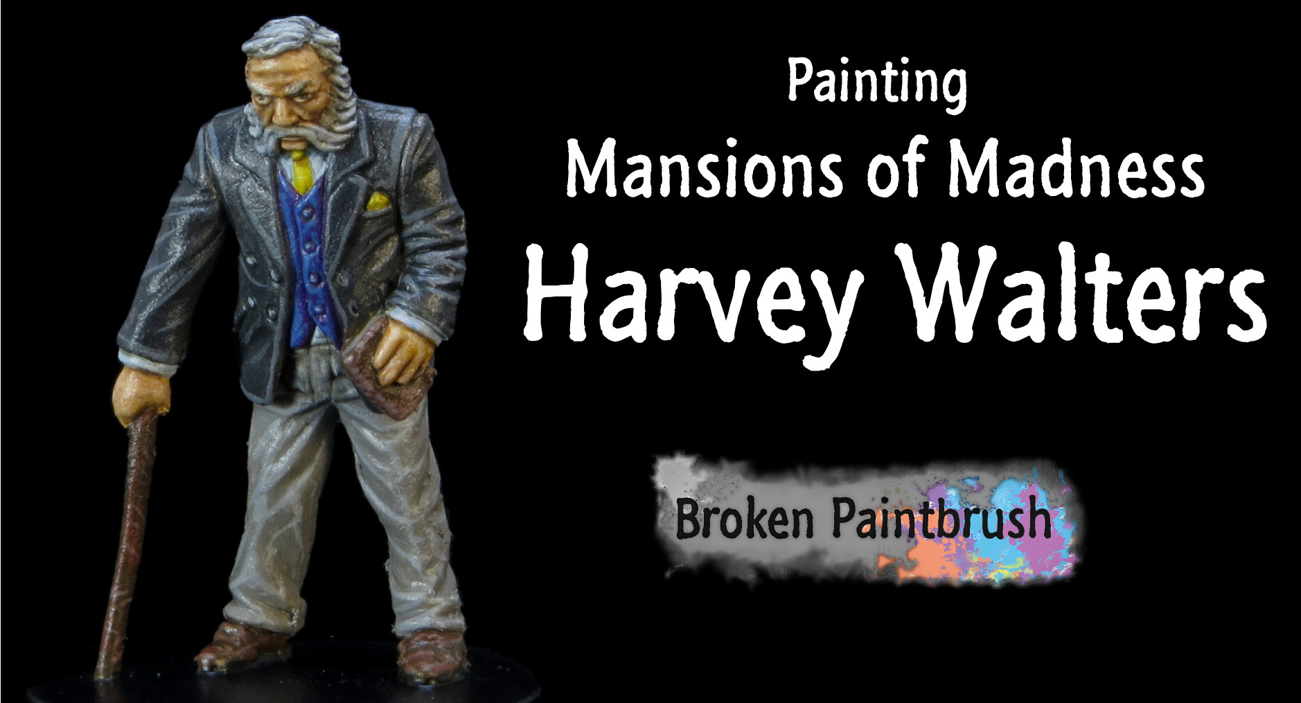
What is an old man doing running around a creepy old mansion? Don’t underestimate the Prof! This week brings a tutorial on painting Harvey Walters, an investigator in the Mansions of Madness game.

Harvey Walters from Mansions of Madness

Harvey’s use in the game is to solve puzzles and has a relatively high sanity – ideal for when the monsters start to show up. He offsets his frailty with a magic staff that allows him to reduce any damage down to one, yup even a Shaggoth can’t swallow the old man whole.

Painting wise, I wanted to give Professor Walters a classic suite, but with a hit of color. A white shirt, royal purple vest, and a black jacket it is. And to set off the vest, a bright yellow hanky.

Color List

As with the rest of the set, I’ve stuck to mostly the Vallejo range as I like their dropper bottles. All the Model Colors used are from the Painting Skin Set.

Skintones:

  • Model Color Light Brown
  • Model Color Medium Fleshtone
  • Model Color Basic Skintone
  • Model Color Light Flesh
  • Games Workshop Gryphonne Sepia Wash
  • Game Color Wolf Grey (hair)

Clothes:

  • Game Color Wolf Grey
  • Game Color Hexed Purple
  • Game Color Electric Blue
  • Model Air Cold Grey
  • Game Color Black
  • Model Color Burnt Umber
  • Model Color Mahogany
  • Game Color Sun Yellow

Step 1: Primer and Skin Base

After cleaning up mold lines, and filling in a bunch of gaps (real common on this set), I primed Harvey white and painted his skin Light Brown.

Harvey Walters from Mansions of Madness with Light Brown Face

It’s helpful on a layered model like this to start from the inside and work outwards.

Step 2: Base Colors

In this fashion, I painted his shirt Wolf Grey, vest Hexed Purple, then his jacket 1:1 Cold Grey & Black, and the pants 1:1 Cold Grey & Wolf Grey. The handkerchief, tie, and shoes were also based.  I then touched up any misplaced paint.

Harvey Walters from Mansions of Madness with Base Colors

I seemed to have missed a picture along the way as the image also shows that I highlighted the skin with Medium Fleshtone.

Step 3: Black Wash

To color in the hair and provide some contrast with his face, I added a wash of Black. This still keeps his hair looking aged, but now has a right amount of shadow.

Using black wash on the hair

Step 4: Painting the Skintones

Next up, I added two layers to his skin: Basic Skintone and Light Flesh. Because the model is relatively flat, some of the highlights were meant to add wrinkles to his face.

Harvey Walters from Mansions of Madness with Skin Tones

The Light Flesh layer left him looking a little pale and lifeless. I fix this in the next step.

Step 5: Face Wash and Blue Vest

Another two-in-one picture. But to fix the too-pale skin, I added a wash of Gryphonne Sepia. This added some earth and shade without being as dark as a brown or flesh wash. I still wanted him to look like an old man.

Harvey Walters from Mansions of Madness with Sepia Wash

I also highlighted his vest with Electric Blue. I didn’t bother with the shirt as so little of it shows through anyway.

Step 6: Jacket Highlights

Now onto the outer layers. Harvey is a classy dude, and sharply dressed. This is why I used a sharper contrast with the Wolf Grey. The tight folds of his jacket would cause brighter edges.

Harvey Walters from Mansions of Madness with Wolf Grey

On a piece that was to be more display than gaming, I would probably do a mid-tone first, or at least shaded with a black wash.

Step 7: Pants Highlights

Wolf Grey was also used on his pants. It’s not as sharp of contrast, but it keeps the colors uniform.

Harvey Walters from Mansions of Madness with Wolf Grey Pants

Step 8: Brown Highlights

Last up is the highlights for the brown. So the book, shoes, and staff all received highlights of Mahogany Brown.

Harvey Walters from Mansions of Madness with Mahogany Brown

The staff also received a few scuffs of Wolf Grey added to the brown to make it looked more used.

Painting Harvey Walters Showcase

And there he is. A painted Harvey Walters from the Mansions of Madness, ready to solve any riddle.

Harvey Walters from Mansions of Madness Painted

I hope you enjoyed this week’s painting Harvey Walters tutorial. Coming soon is a tutorial on using his ski recipe (and a few others) to do a light skin version of my dark skin tutorial.

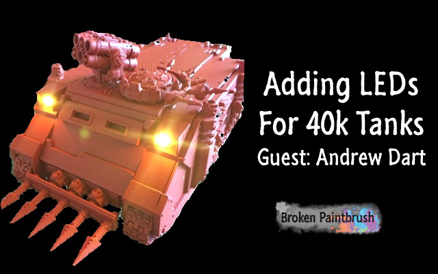
How-To: Adding LEDs to 40k Tanks

When I go into my local Games Workshop store, people can’t stop talking about my models. Why? It’s because they light up! And I want to show you how easy adding LEDs to your 40k tanks, vehicles, and terrain can be.

Guest post from Andrew Dart, originally posted on his blog, which he is phasing out. Instead, find him on Instagram as @hobbyvices. This post is helpful for me because I’ve been trying to add LED lighting to my Knight Titan and Stompa as I build them. Shine on!

Adding LEDs to 40k Tanks

My land raider was the first time I’ve ever used LED wiring components in my entire life, and it was ridiculously easy.  Much easier than I anticipated.  I’ve repeated the process on a Rhino transport for my Berserkers to do a step-by-step for anyone curious or scared at the idea of dealing with LEDs.

Ordering the Supplies

All materials for wiring and lighting came from Evans Design.  I find them to be the best quality, and alarmingly straightforward – they come pre-wired! Make sure you match the voltage (there are only two options) with the associated LED.

Assembly is as simple as connecting the wires.  To make the connection, twist black to black, and red to red.  You’re ready to go! In fact, The hardest part is deciding what colors you want!

Pick the Colors

In my example below, I used two 3mm “warm white” LEDs for the headlights and one 5mm Green for my interior lighting, all 3v.  I also used the coin battery with a toggle switch.  My Land Raider used the 5mm LEDs for its headlamps if that gives you any indication on the scale.  You either could work, honestly, so don’t get too worried about matching the size exactly.

Adding LEDs to a Rhino

Without further ado, here’s my Rhino tutorial, but the project can be scaled up and made much more complicated.  This is simply a basic framework from which you can experiment and learn new techniques!

Let’s go!

1. Always dry-fit the pieces

Testing fitting the rhino assembly

Testing fitting the rhino assembly

Dry fitting is especially important for vehicles to make sure there are no problems in later steps.  But a dry-fit also gives you a broad view at where components will be placed and adjust parts as needed. 

In this example, I’ve decided to put the battery and switch in the driver compartment (smooth surface) and the wiring in the track guards.  The track guards on vehicles are usually the best place to route headlamp wires, as it’s out of sight of interior space. 

If you’re one of the guys that glue the rear ramps shut, you have much more room to play with, and can even fit a 9v battery in there for some serious “Christmas Tree” scenarios.

2. Mark the Cuts

Marking the cut lines

Marking the cut lines

Here I’ve taken the Rhino apart again and marked out where I’ll Dremel out a hole on the bottom of the tank.  The square below the driver compartment will be cut away and allow access to replacement batteries and the toggle switch.

Remember to make it large enough for fingers to manipulate the switch or remove a battery! 

The round holes on the sides are where you will feed the wiring to the headlamps.  Not pictured are the top plates of the track guards where I’ve drilled out space for the lights to connect.

Be sure everything lines up and you have enough wire length to reach each of these places!

3. Starting to cut!

Cutting the openings

Cutting the openings

These don’t need to be clean cuts as I will hide the opening in a later step.

I used a Dremel to cut open the armor plates. Be careful with the power tools as they can make a mess of plastic (and fingers) very quickly.

To add some light to the interior, the sonar panel section on the command console was conveniently the same size as the 5mm green light. As a bonus, it becomes disguised when the light is not in use.

4. Dry-fit again!

Headlight holes

Headlight Holes

Again, don’t glue until you are 100% planned out on where things are going and have double checked to be sure you know where wires are going.

If I were to have glued at this stage, I would need to thread the headlamps from inside the cockpit, and out the front holes, which would be damn near impossible.  Do this in separate stages while it’s all unglued. Only once you have installed the LEDs should you fit it together.

5. Threaded and glued!

Threading the Headlights

Threading the Headlights

The careful observer will note that I made a big mistake here.

See how the wires come out the front plate section (where the windshield would go)?  That’s intended.  However, I accidentally threaded two of the wires from below the cockpit (you can see it running under the vehicle) to the interior green light (where the mash of greenstuff is).

I have two sources of wire coming into the center, looped to a battery (out of frame), there is no way to get the entire assembly inside the vehicle!  This meant I had to re-wire the connections, a very tedious (but doable) step that could have been avoided had I checked myself.

Planning is everything!

Take these steps slow, and be methodical, you’ll be happy in the end.

6. Try it out

Testing the headlights out

Testing the headlights out

The wiring was corrected as per the previous step and then tested to ensure connections. You should not see any flickering or dimming when you jostle the wires. 

Always check to be sure the connections are solid before gluing everything together.  If a wire comes loose after it’s built and painted, you’re probably not getting inside the track guards. 

I twist and bend my connections. In hindsight, a better recommendation would be to use electrical tape to make sure its secure. I wouldn’t recommend super glue as it will likely break the circuit connection.

7. Add the Switch

Add the switch inside the hull

Add the switch inside the hull

The switch is fixed into the bulkhead with superglue to give leverage when pressed – which is something I neglected on my Land Raider.

On the Land Raider, I have to pinch the unit by holding the back and pressing the toggle. Hindsight is a powerful ally here, you’ll certainly make mistakes, but learn from them!

Leave the battery free, however, as there’s almost no way to get a disc battery out without gripping the top and bottom.  You’ll want the wires a little loose to pull out of the opening as well, to make it easy.

8. Add Magnets (Optional)

Magnets to cover the hole

Magnets to cover the hole

Magnets on the bottom will be used to secure a plate to keep the free-floating battery unit from falling out.  It has enough friction and wires tangled up in there to not randomly fall out, but I wanted to be extra safe, as I did with the Land Raider.

I eventually used a spare armor plate that came with the Rhino (the one to make it a Predator turret instead of a top hatch).  While it isn’t as clean and well-hidden as the Land Raider (the rear power plant on the Land Raider is practically begging to be magnetized), it serves the same purpose.

9.  All Done

Finished and primed

Finished and primed

The lighting has been completed at this point – now it’s on to painting!

Tape your lights with a small amount of painter’s or masking tape.  I spray my vehicles red. If you do all this work just to spray over it, you’re not going to be happy.

Scraping the paint off of tiny LED bulbs isn’t fun – but it’s possible, should you forget.  If you painted the interiors, be sure to tape closed the ramp, so you don’t get any spillover into a potentially finished interior.

10. Interior Lights

LEDs for the Rhino Interior

Rear shot of interior light, and functional ramp

I strongly recommend painting interiors before assembling or lighting.  I did this on my Land Raider and was very pleased.  The Land Raider has several functional doors and an elaborate interior, so that was a given to paint it carefully.

For this Rhino, I just gave it a quick once-over and was satisfied.  I’ll do some detail work later if it strikes my fancy.

Nice little tip: shave down the top of the rounded LED so it’s a flat surface diffuses the light. I’ve done this for all my interior lights, and it appears to work.  Otherwise, you get a circle of light projected straight out, something that isn’t conducive to an interior light!

11. Finish the Model

Finished Model

Finished Model

For my tanks, I do some freehand designs, a couple of washes, and selective edge highlighting. Later I weather the model and finish the details.

Wrap Up

There you have it!

A finished Rhino illuminated with LEDs in under two hours.  With the pre-wired kits from this website, I cannot stress how simple and effective it is to add a little something extra to your kits.

The possibilities are endless!  They have LEDs the size of a pencil point!  You could do Daemon’s eyes, individual cockpit indicators in a Valkyrie, terrain illumination – anything!

The above method is simply a basic how-to, there can be a broad range of uses, so get to thinking!

Give it a try, and let me know what you think below!  If you have pictures of your own, please share them, or join the Google+ Warhammer 40k community and let everyone there know!